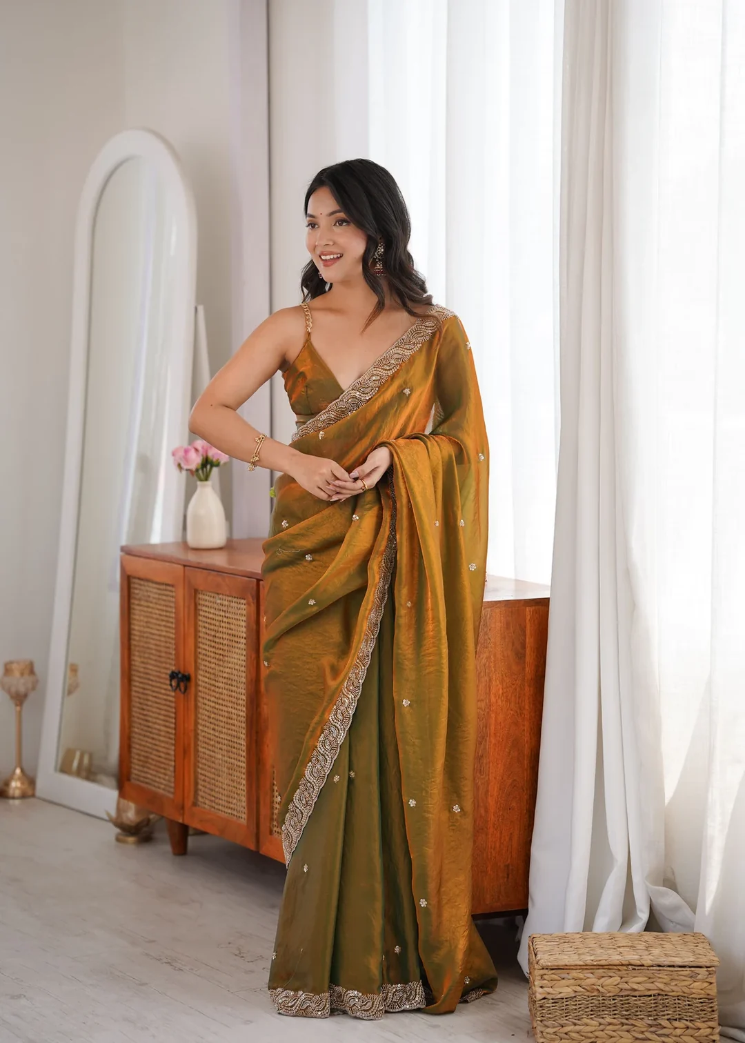
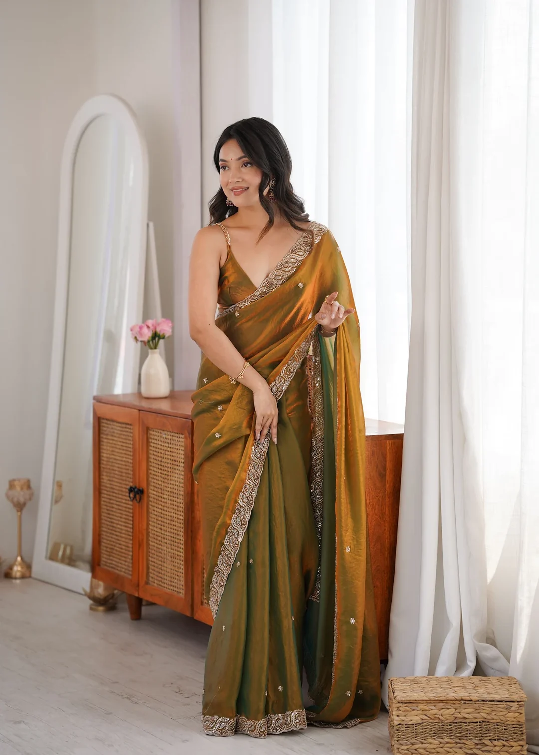
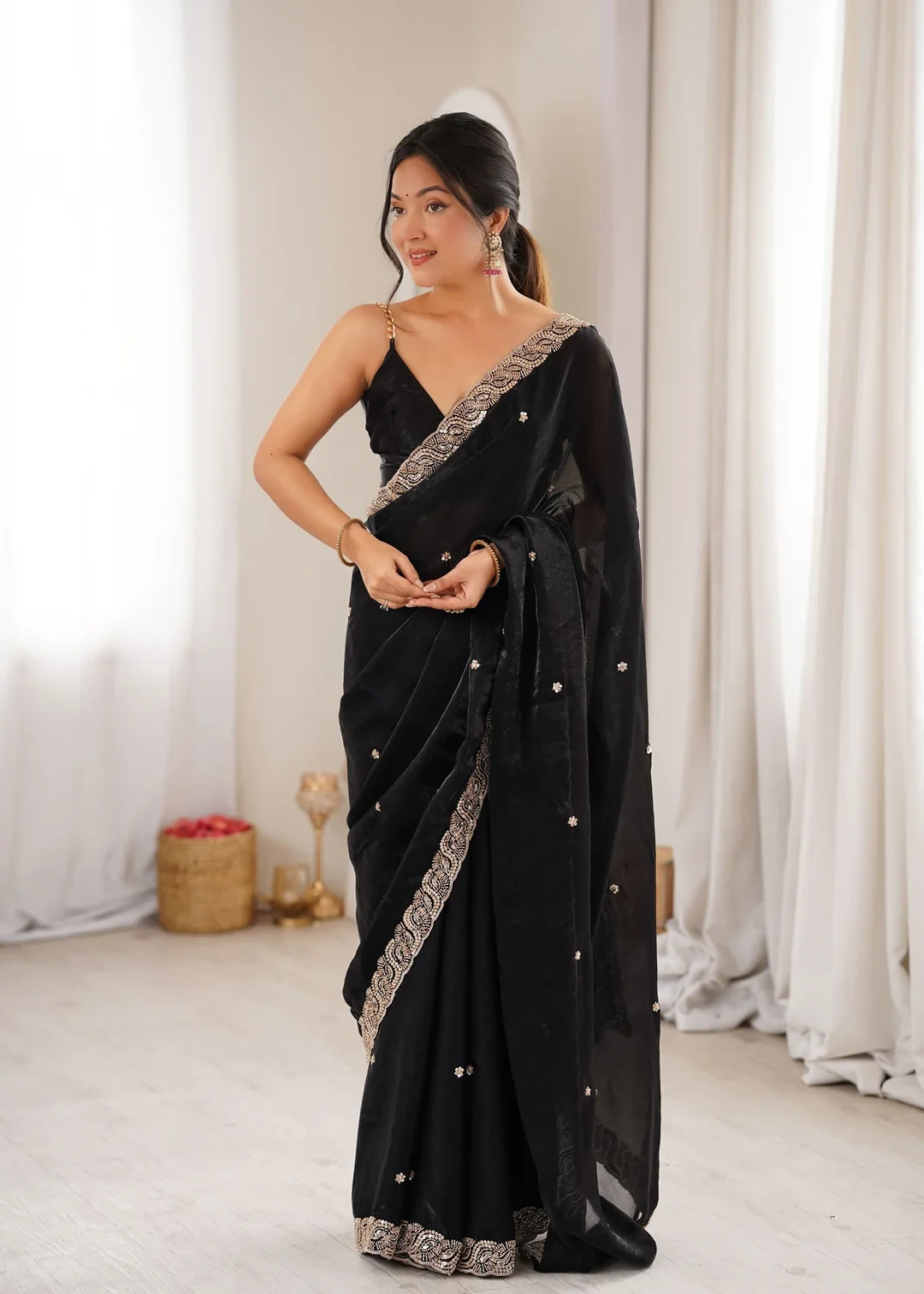
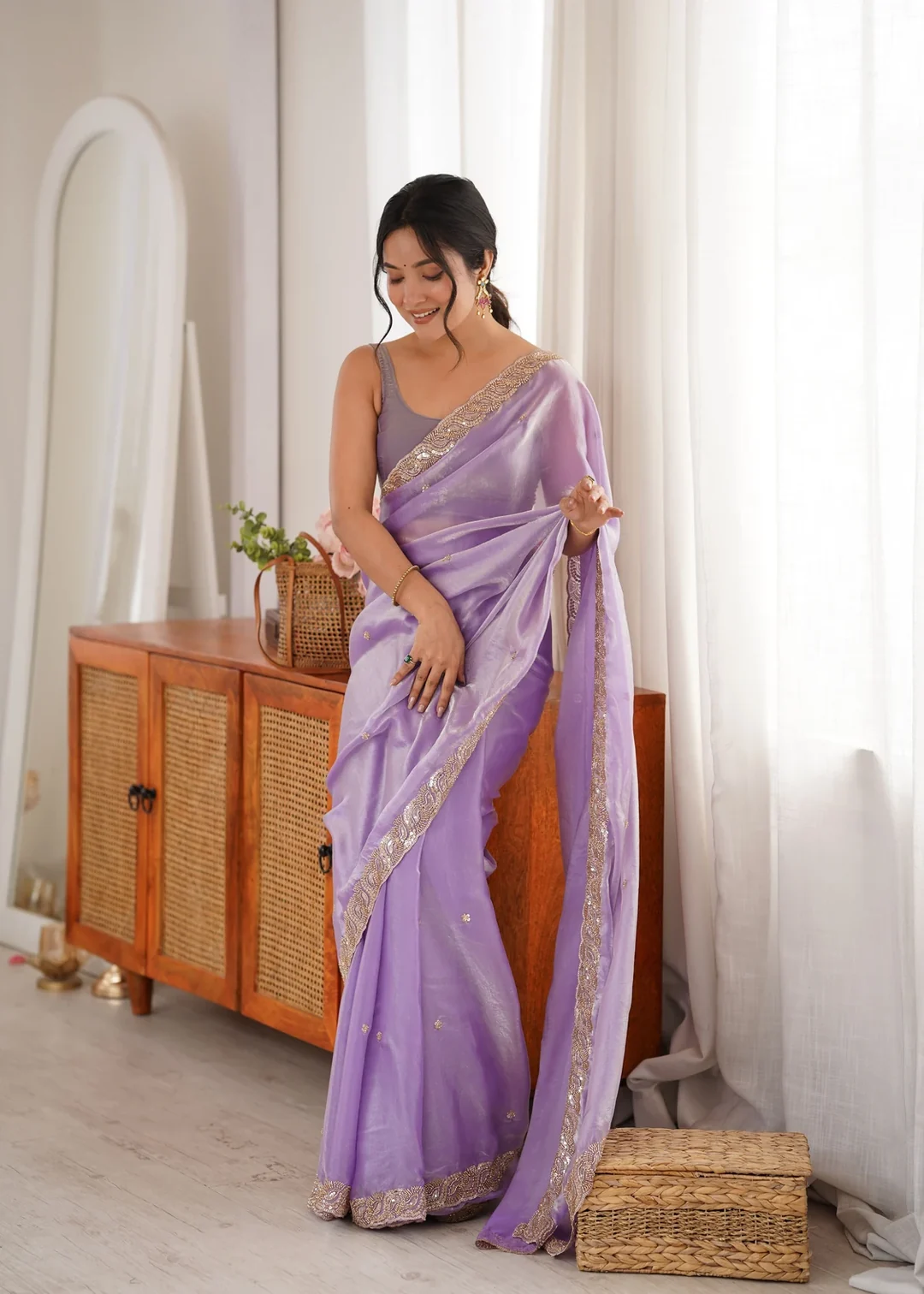
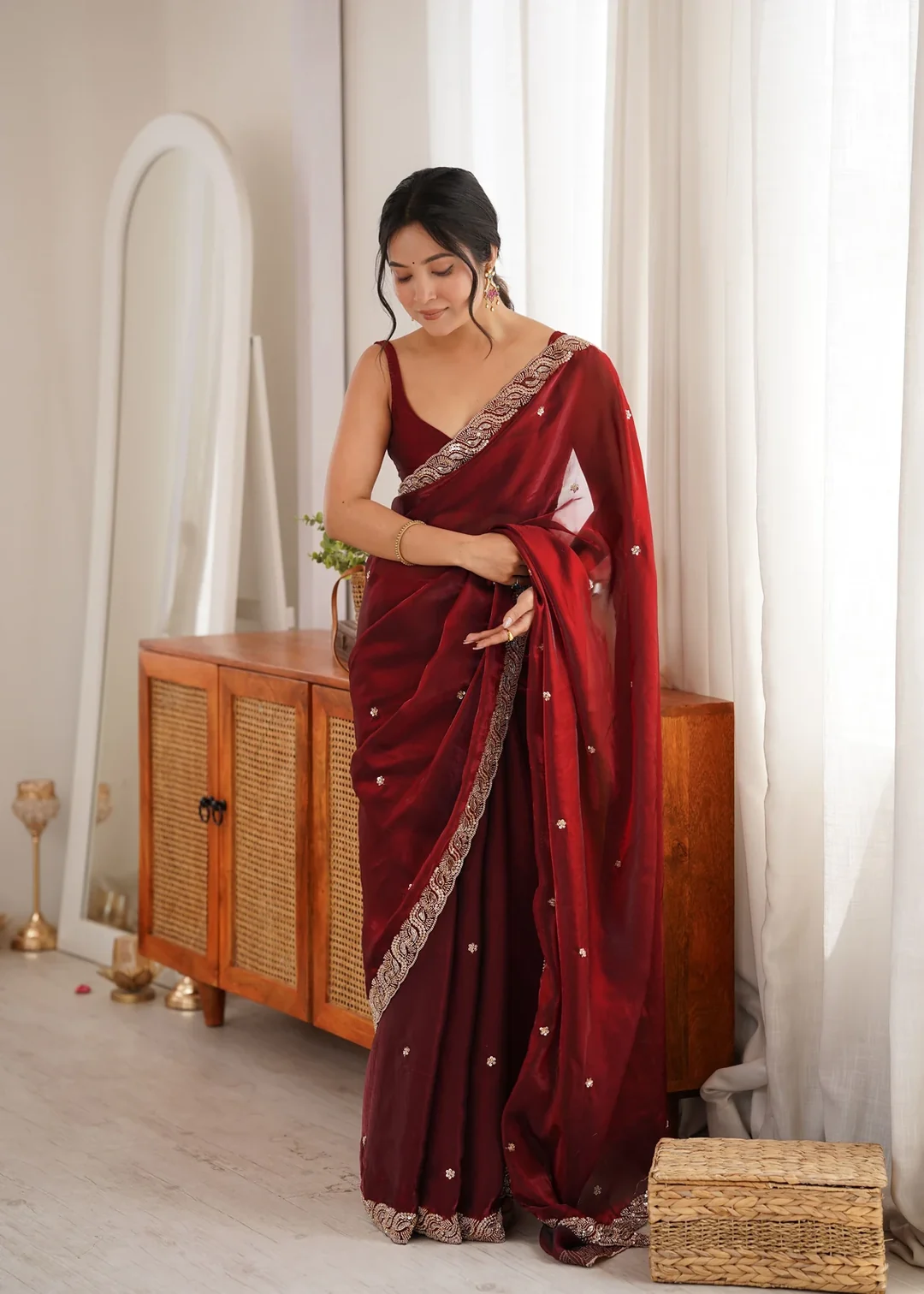
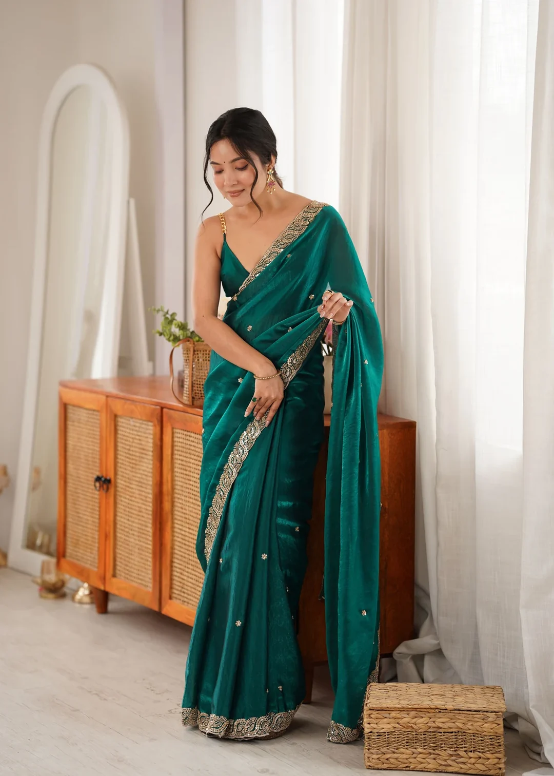
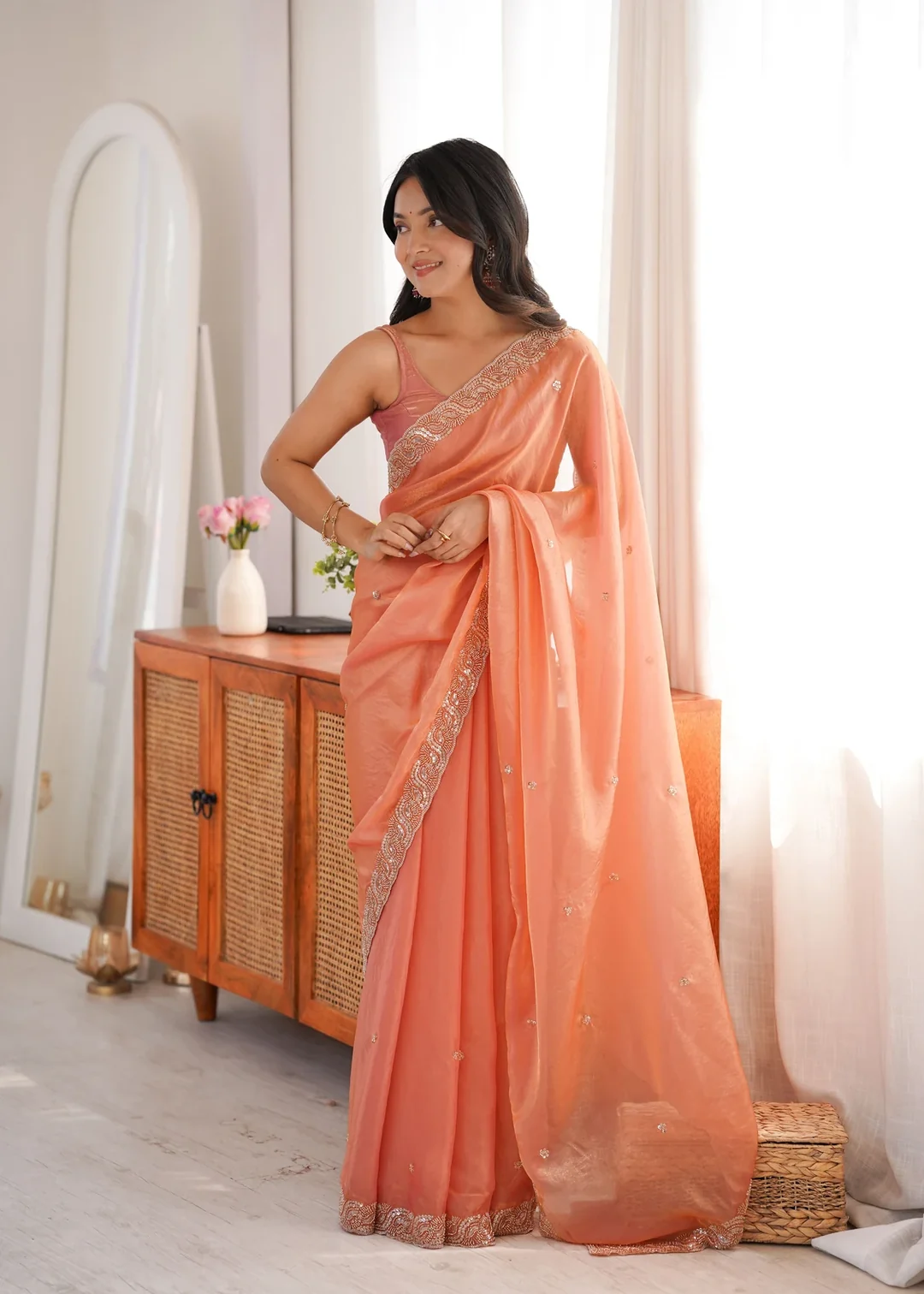
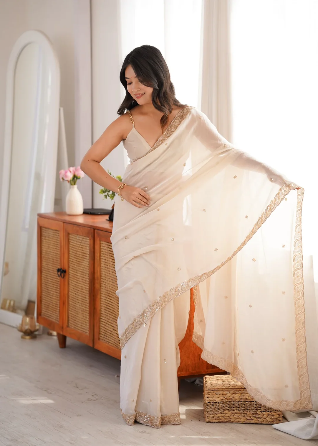
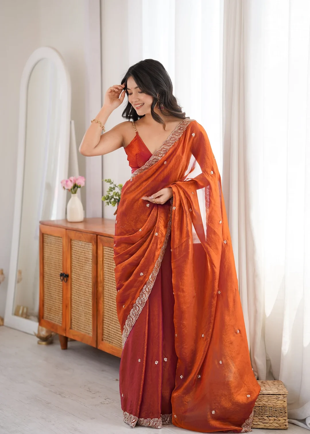
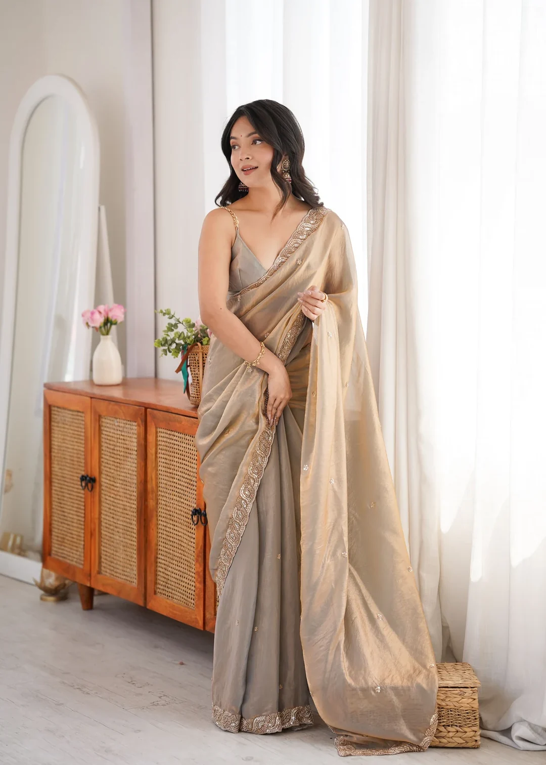
Does a muted colour look dull on a festive saree?
Not in satin. A desaturated green would look flat in a matte weave, but the sheen supplies brightness the dye withholds, so the drape still carries lit crests and deep shadowed folds. The interest shifts from the colour to the fabric and the embroidery.
Why does the embroidery read well on olive?
Because olive sits at a mid depth with low saturation. There is enough darkness in it for pale pearls to stand out clearly, and little enough colour intensity for the beads to keep their glint. A very bright or very dark ground would favour one element over the other.
Is olive an unusual choice for festive wear?
It is less common than red, pink or maroon, which is part of its appeal. Olive reads as considered rather than conventional and works for an evening reception, a festive dinner or a family celebration where you would rather not wear the expected shade.
What jewellery suits olive green?
Antique gold and oxidised metals complement a muted green particularly well, since their dulled finish matches its restraint. Bright polished gold or silver can look sharp against it. Textured jewellery generally suits a desaturated shade better than high-shine pieces do.
How much of the saree is embroidered?
The product details record beads and pearl embroidery as the work on this saree but do not specify how much of the drape it covers or where it is concentrated. If placement matters for your choice, it is worth asking before ordering rather than assuming.
Can I return this?
Yes. Vpnam has a 7-day return window, and the full terms are in the Refund and Returns Policy. Contact us within 7 days of delivery if the item arrives damaged or defective, an item is missing, or a different product was sent, and keep the item, tags and original packaging unused while the claim is reviewed. Worn, washed, altered or tailored products cannot be returned.