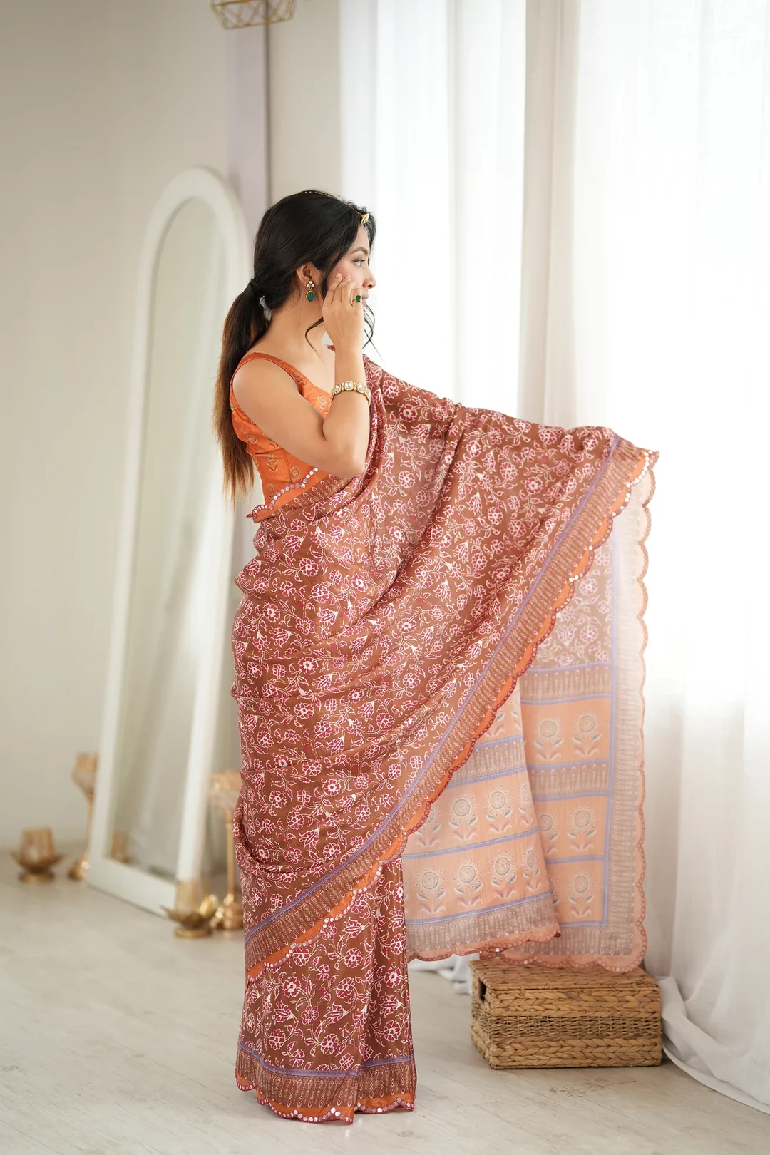
Do orange and maroon clash?
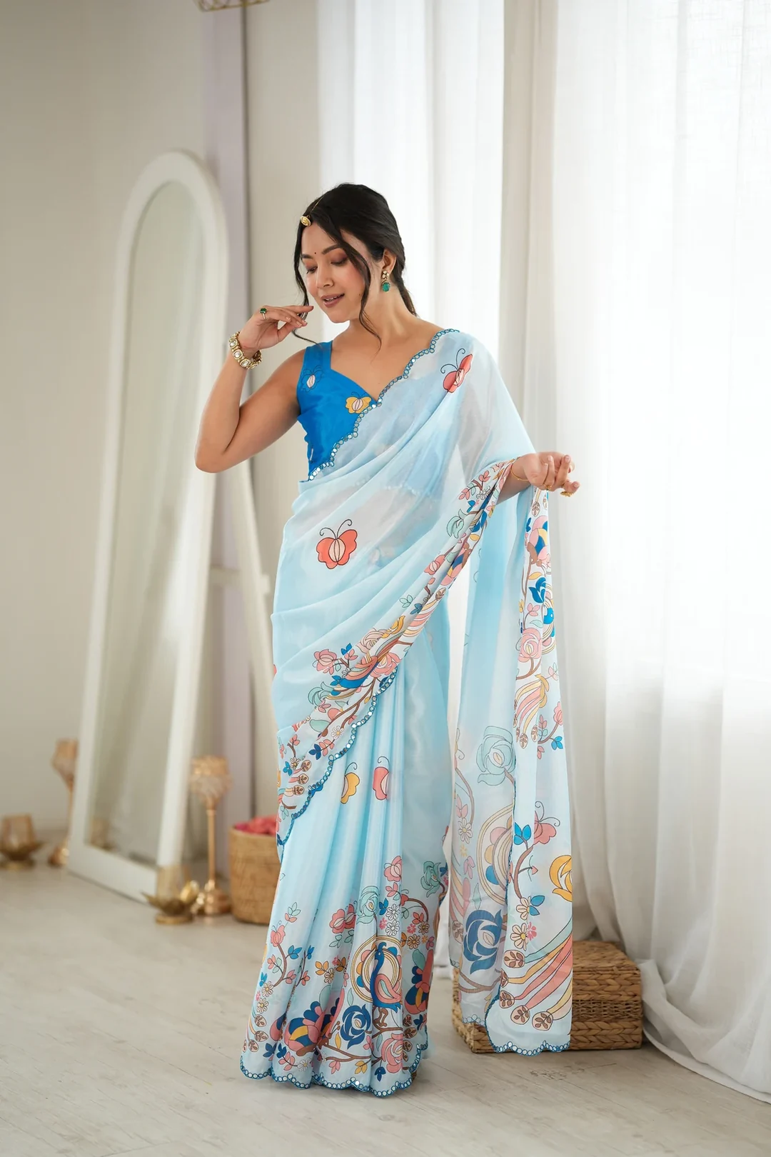
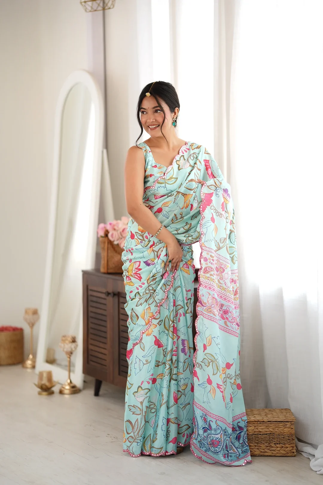
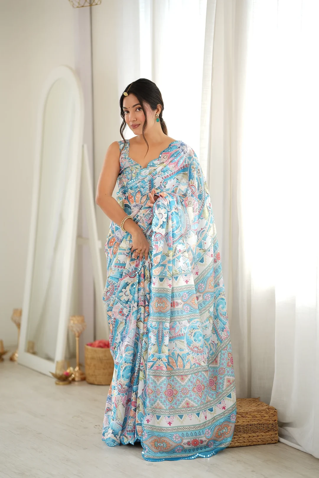
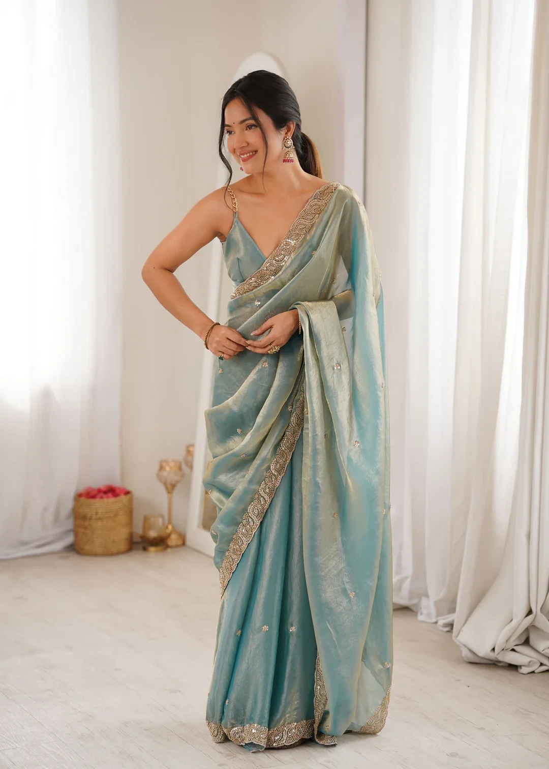
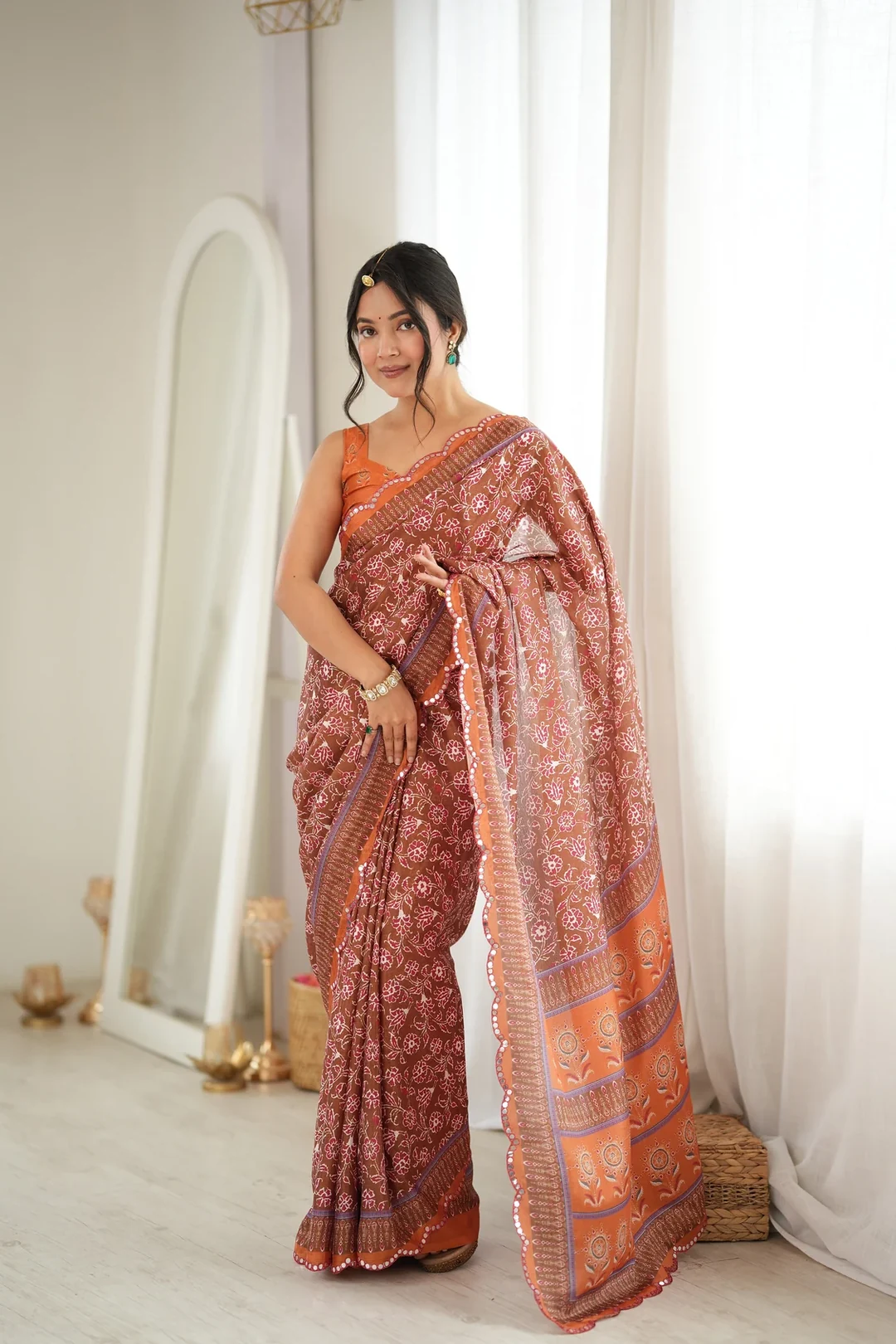
They do not, because both come from the same warm family. Maroon is essentially a deepened red and orange sits beside red on the other side, so putting them together produces tonal depth rather than a clash. The print reads as layered instead of contradictory.
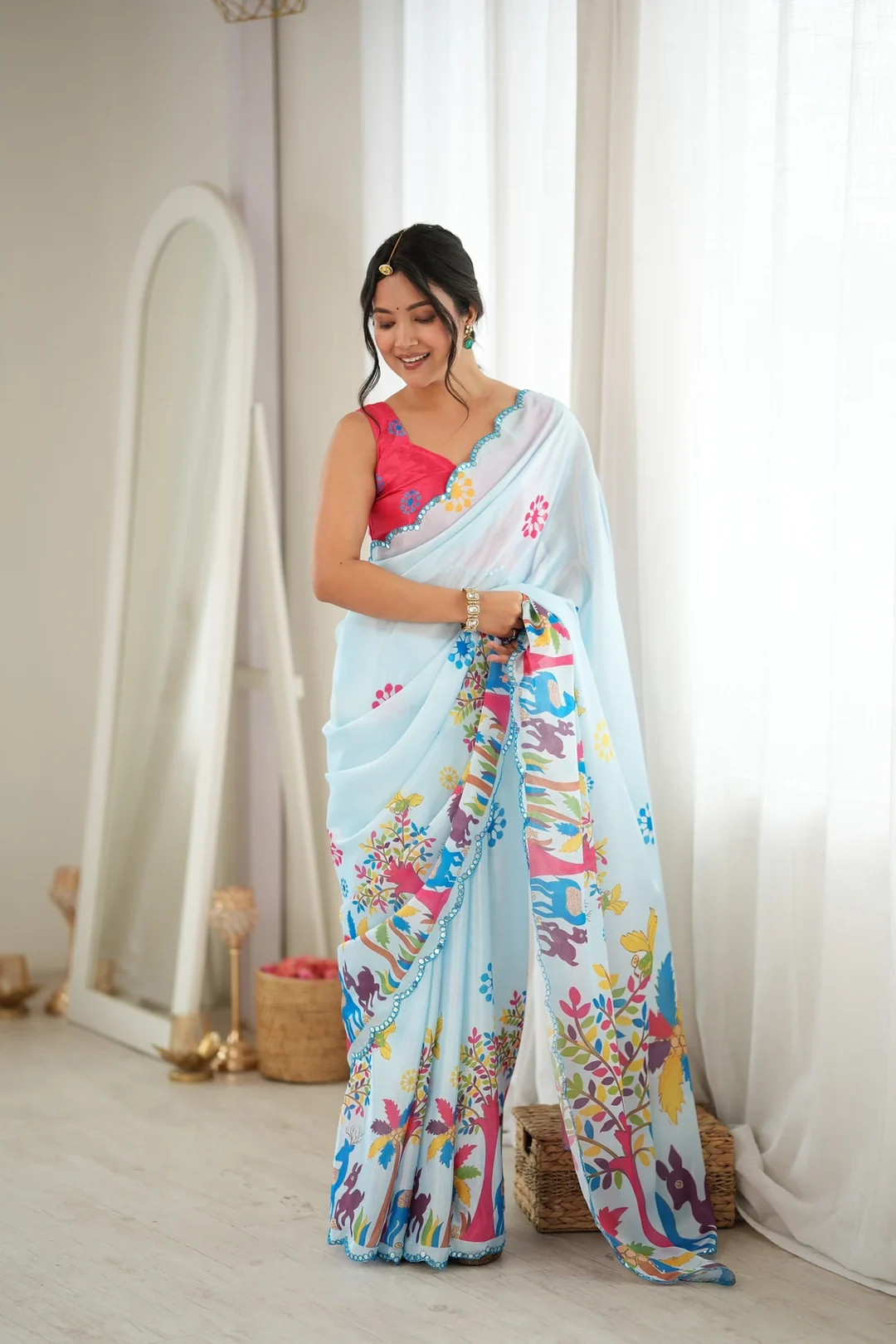
Why does chinon suit a saturated print?
Because the fabric contributes nothing visually of its own. There is no sheen to interfere with the printed colour and no weave texture to break it up, so you see the design rather than the interaction between the design and the cloth underneath it.
Can mirrors be seen against a bright ground?
Yes, because a mirror returns light rather than colour. The disc stays neutral even where the fabric around it is at its most intense, so the work reads as a bright point against orange just as it would against a muted shade, though the contrast is lower.
What is this saree best suited to?
Strong warm shades work well for evening festival wear where the lighting is bright. A garba night, a Navratri function or a lively family celebration all suit this palette. It is a more assertive choice than a pastel or a neutral, which is the point of it.
What accessories match this palette?
Glass bangles and gold jhumkas match the energy of a bright warm print without adding another colour to compete with it. Because the saree already carries two strong shades plus mirror work, jewellery that echoes rather than introduces tends to give the better result.
Can I return this?
Yes. Vpnam has a 7-day return window, and the full terms are in the Refund and Returns Policy. Contact us within 7 days of delivery if the item arrives damaged or defective, an item is missing, or a different product was sent, and keep the item, tags and original packaging unused while the claim is reviewed. Worn, washed, altered or tailored products cannot be returned.